Victorian Reports Overhaul
We acknowledge the Aboriginal people as the Traditional Owners of this land, and pay our respects to Elders past and present. Working from Darug and Gadigal land.
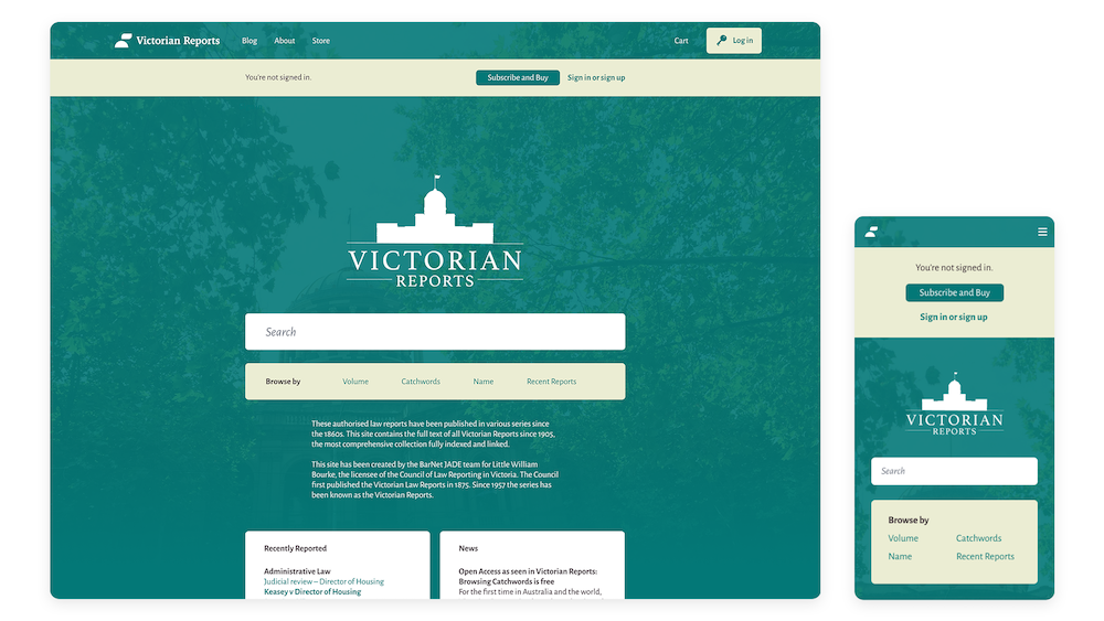
The Victorian Reports website is a digital publishing platform for the Council of Law Reporting in Victoria. This project aims to overhaul the Victorian Reports' website with a focus on enhancing the end-to-end user experience.
Contents
Special thanks
Thank you to the director of Open Law – Michael Green SC for the opportunity to work on this project. I would also like to thank Nick Clark who showed me the ropes to Tailwind, SASS and taught me so much about frontend development with immense patience.
1. The team
| Human | Role |
|---|---|
| The Open Law Team | The software development team are the ones who bring my designs to life. Can't do it without the team! |
| Me! | Lead Designer – completely overhauled the user interface from scratch using reusable components from my UI Design System to enhance the end-to-end user experience. Assisted the frontend development team by developing a stylesheet framework and converting designs to code through SASS and HTML. |
2. The problem
Updating the user interface design to have a more modern look and feel while identifying painpoints in user experience.
3. Solving the problem
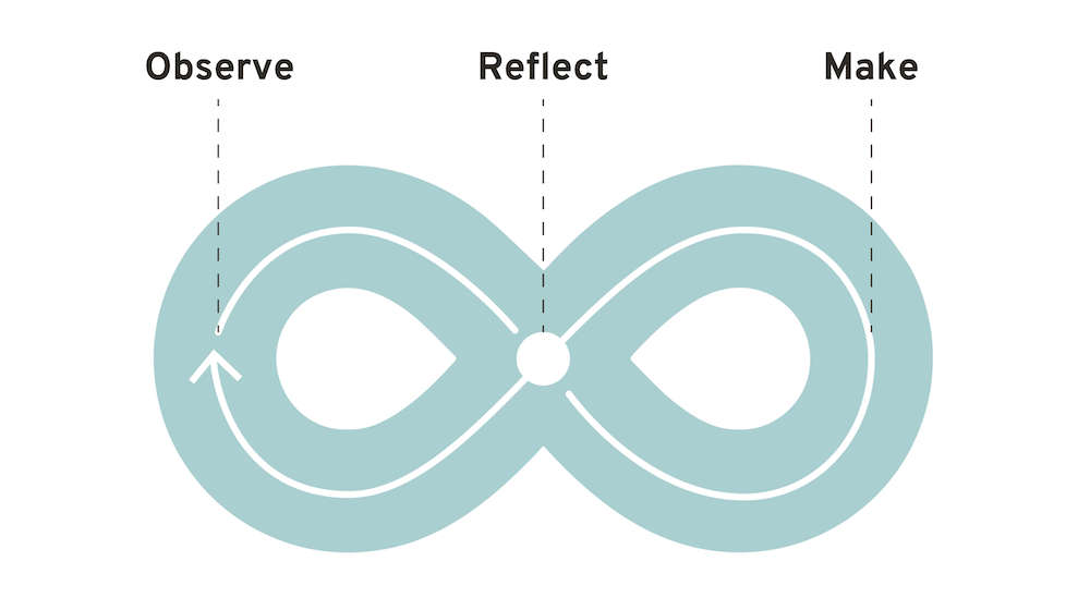
This project was completed using a lean-agile approach, focusing on how we can bring value to our customers through iterative cycles and continuous feedback loops.
The infinity diagram below is adapted from the IBM Enterprise Design Thinking Framework.
Since the Victorian Reports website has been a long-standing platform available to users online, I started the design process from reflecting on what we have so far.
Reflect
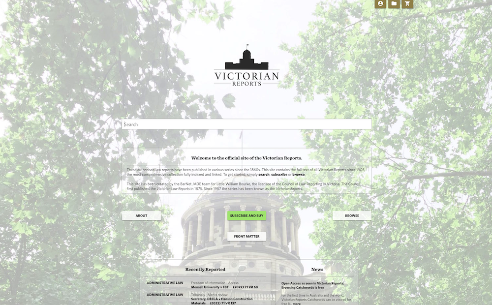
The existing Victorian Reports website had several blockers in the user flow that detracted from the overall user experience.
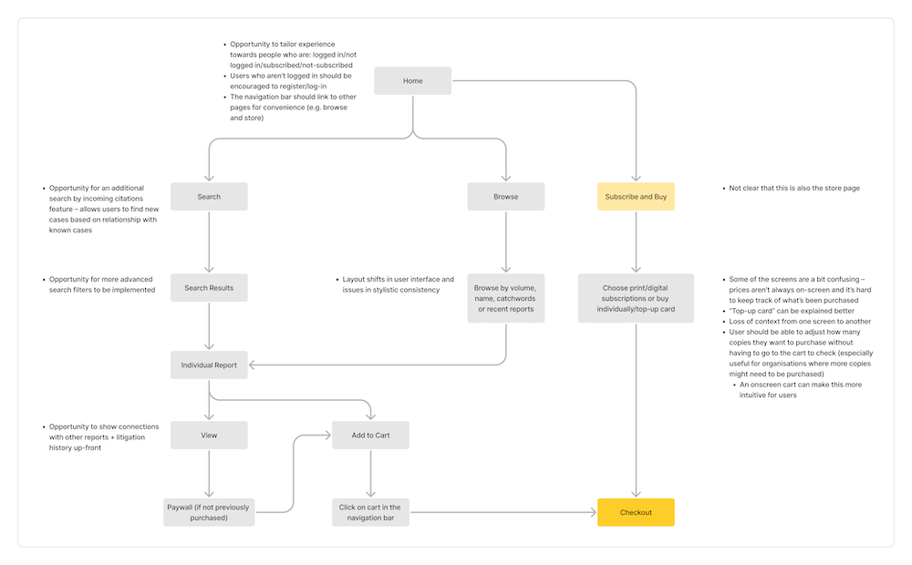
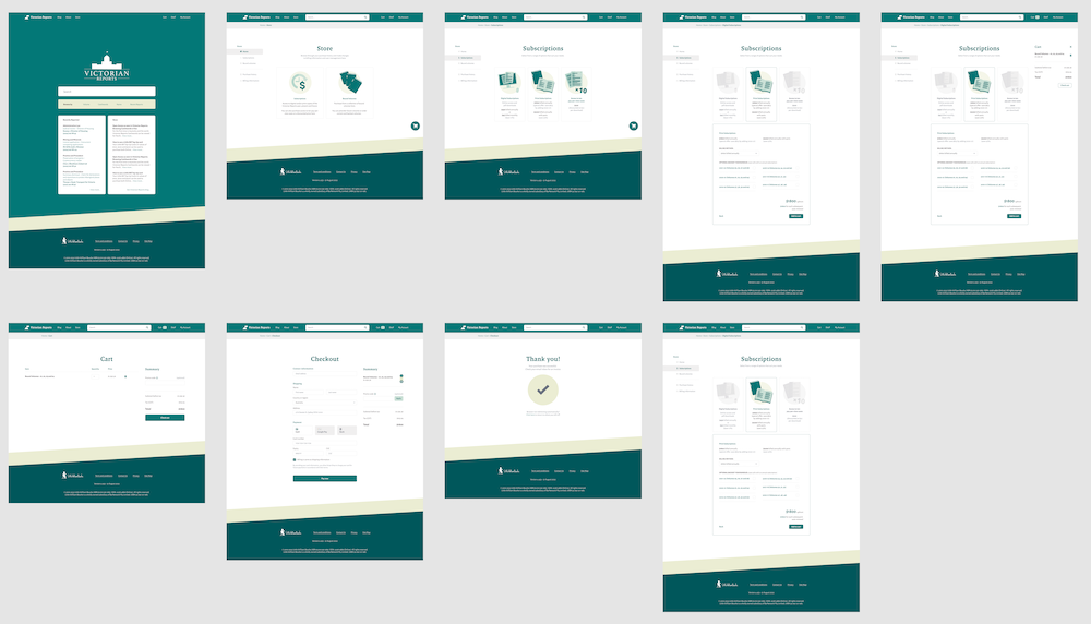
Disruptive eCommerce flow
A cohesive and seamless eCommerce flow is essential to any digital product for bringing in monetary value for the business.
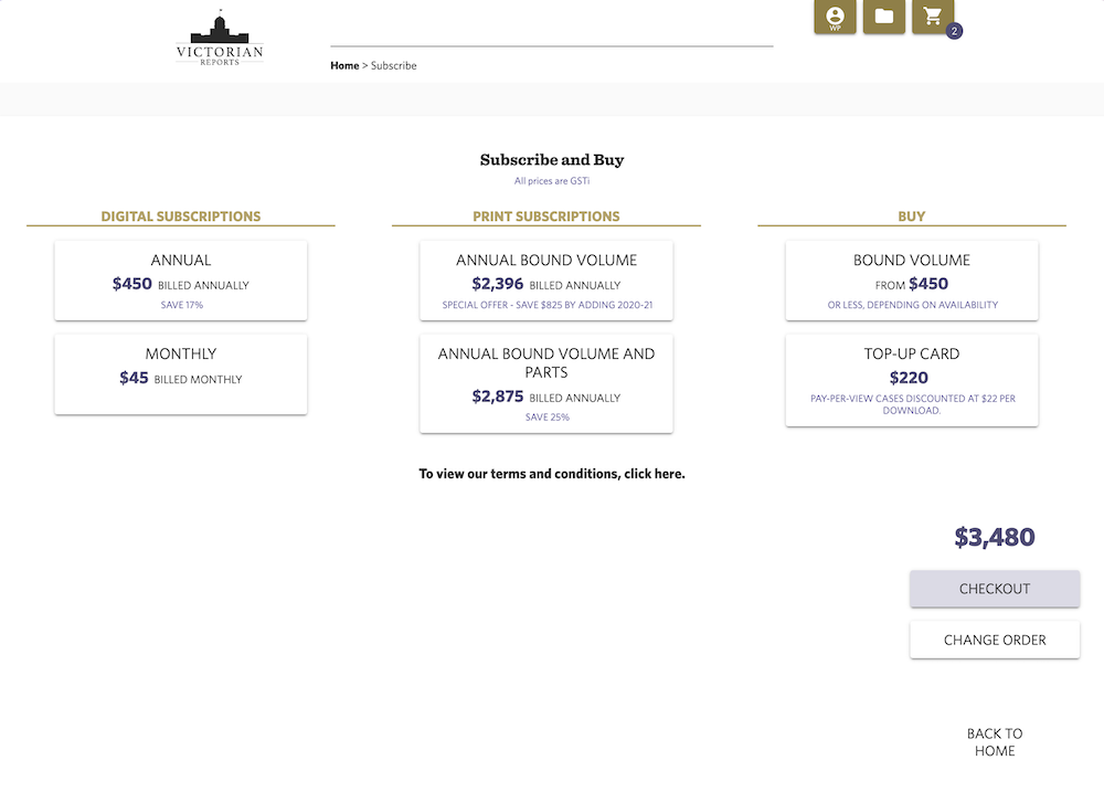
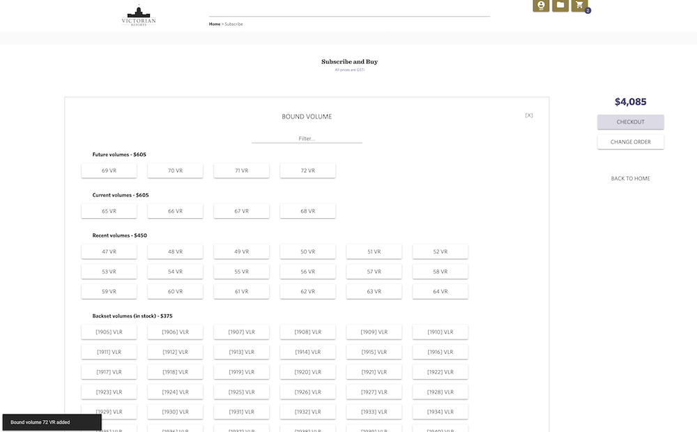
The previous user flow of the Victorian Reports website required the user to recall rather than recognise what items they have already added to their cart, and how much money each item costed. The lack of information onscreen to help customers make informed purchase decisions contributes to the ambiguity effect, which can decrease their feelings of trust towards the platform and lead to hesitation to finalise purchases.
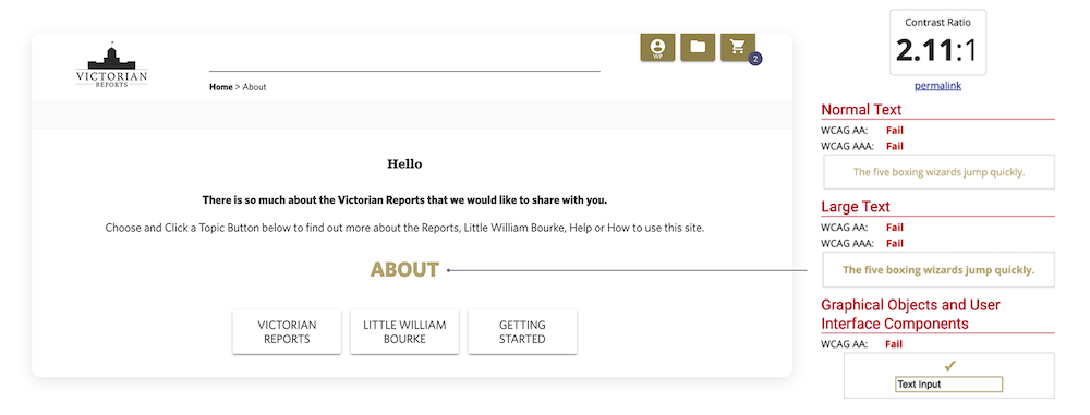
Lack of adherence to the WCAG accessibility guidelines
Throughout the site, there were areas that did not adhere to the WCAG AA accessibility guidelines. Considering accessibility in design is crucial to allowing all users to access and interact with the website effectively in an inclusive way.
Inconsistencies in design
Consistency and standards is a design heuristic crucial to the feeling of seamlessness in user experience. Inconsistent styling of elements like buttons can detract from brand uniformity.
Observe
After reflecting on the key issues in the existing design, observation of users was the next step crucial to designing for a user-centric solution. I created lean personas representative of the key needs and painpoints of our target users. User journey maps were also used to identify painpoints in user flows.
Lean persona
 Jane Doe – An Australian Lawyer
"I want an online platform that will let me access the most up-to-date legal information conveniently"
- Access to current and comprehensive legal information
- Search feature to look through reports
- Download .pdf versions of reports for offline use
- Save useful documents for future use
- A need to purchase required reports quickly
- Integrating technology to streamline the research process
- Wanting an easier way to view connections between cases and legislation
- Difficulty finding cases that are useful to their practice
 John Doe – An Australian Lawyer
"I want to be able to stock up on physcial copies of the Victorian Reports for my office library"
- Ability to order physical bound volumes of the Victorian Reports
- Desire to backfill orders for missing volumes in his library
- Need to keep track of purchasing invoices for tax and billing purposes
- Finds it difficult to navigate digital websites
- Difficulty purchasing multiple copies when needed
- Wanting an easier way to find the exact volume they're missing
User journey maps
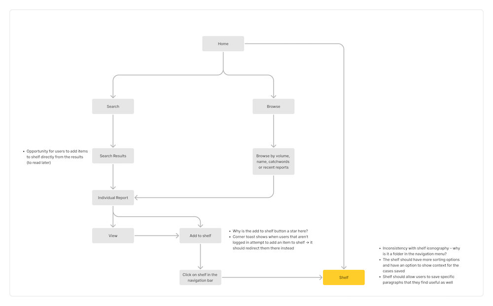
Some user journey maps of the existing site were created to see opportunities for improvement in the existing eCommerce and adding to shelf journey.
Make
After doing an audit of the existing website, I got around to creating designs for the renewed website. This involved sketching and prototyping.
Sketches
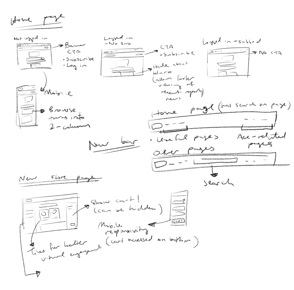
Sketches for the initial ideas were messy, but helped to jot down the key components that we wanted to revamp.
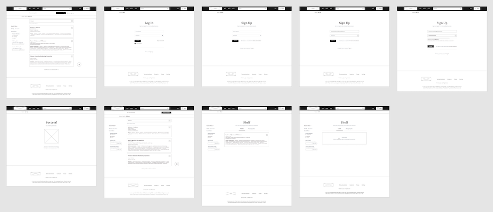
The below sketches shows some drafts of UI that adapted to authentication, a new navigation bar with more useful links, and engaging store pages with mobile-responsive design.
Prototyping
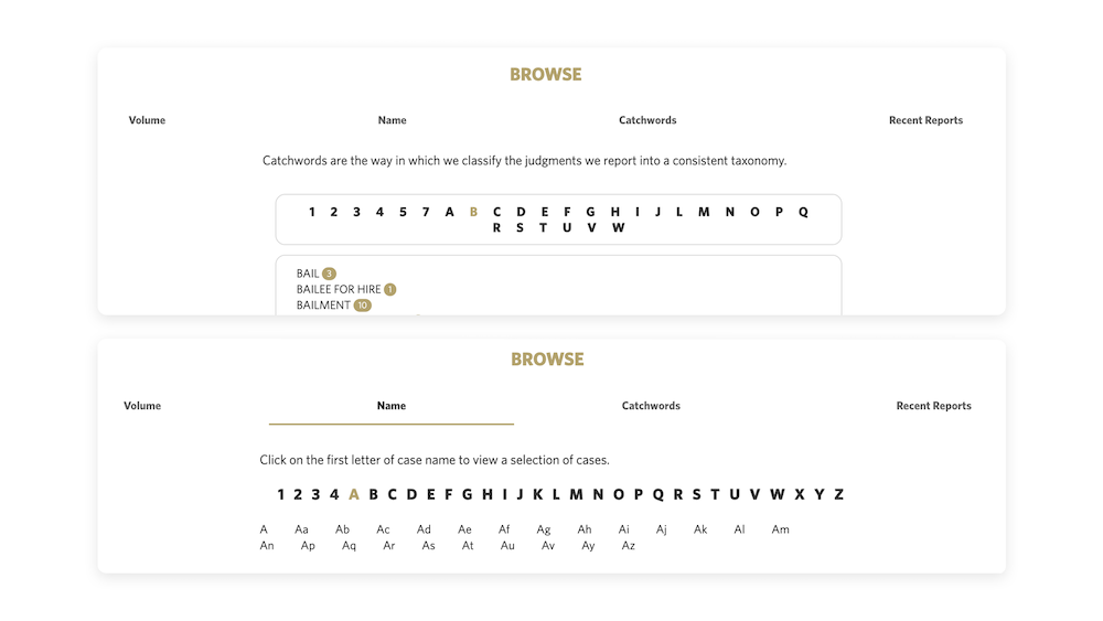
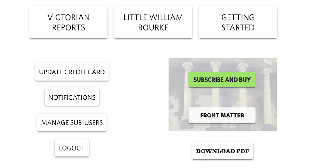
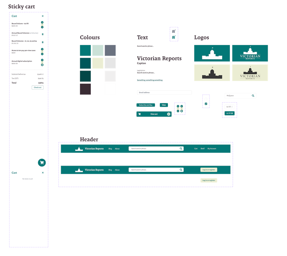
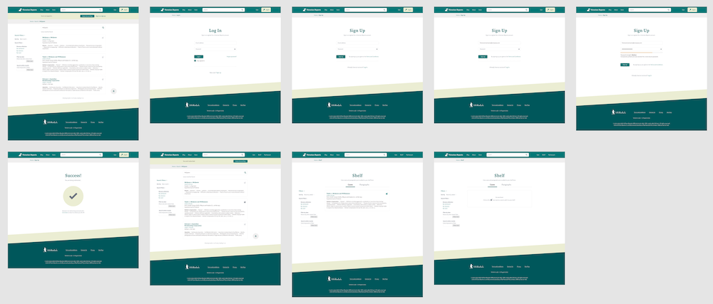
The prototyping phase involved wireframing and high-fidelity prototypes. Wireframes were used to help with the initial iterative process before components from the Open Law Design System was integrated.
4. UI designs
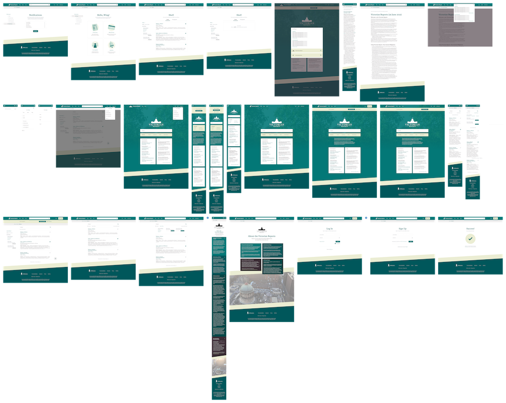
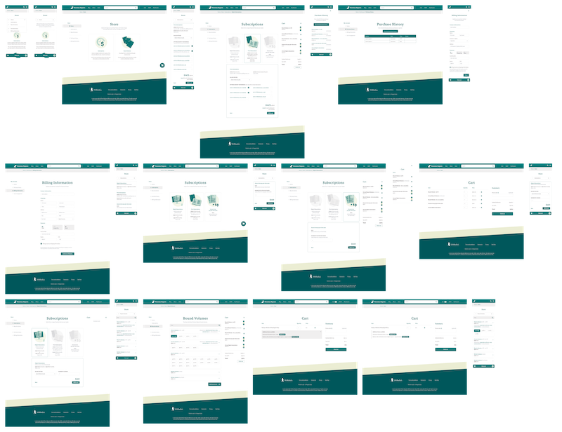
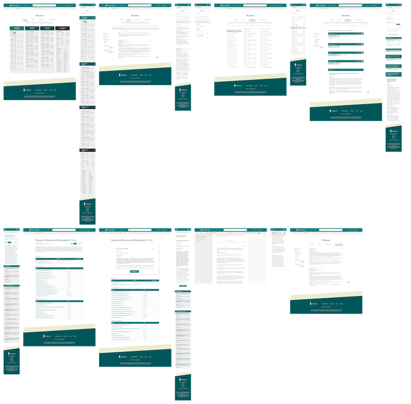
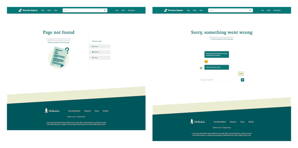
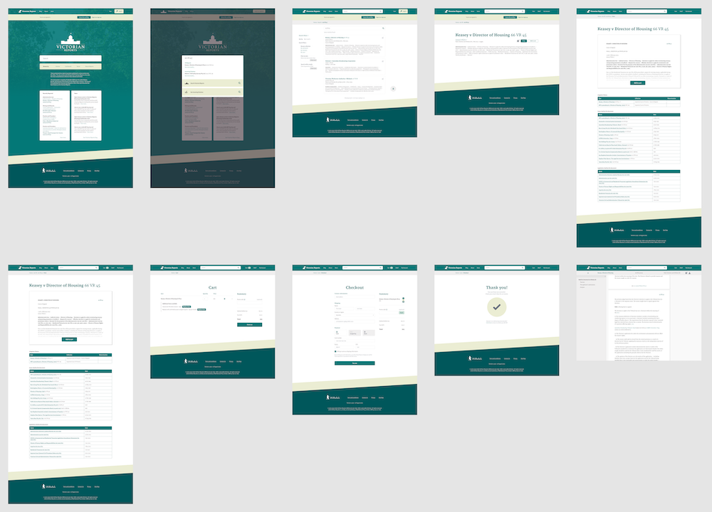
By the end of the project, virtually every screen of the existing website was refreshed to follow the new branding.


5. Final comments
After finishing the Figma redesigns and prototypes, I went on to help with building the frontend components using SASS and HTML. Although the project hasn't been launched yet, most of the frontend has been completed.
Some key takeaways and learnings I've gotten from this project through user testing and self-reflection were:
The small things add up
Analysing the small inconsistencies in design of the existing website showed that small differences in padding, style and spacing can lead to a disjointed user experience.
Collapse where possible
For mobile screens, having collapsible sections really help to reduce the amount of scrolling required, allowing users to skip right to where they want their content.
Aesthetics do matter
The main user flow/functionality of the redesign remained quite similar to the existing website, but by updating the design to look and feel more modern, the product feels more usable.
I really enjoyed working on this project and pushing the boundaries on how I could give the Victorian Reports a refreshed branding. In the future, I would like to spend more time on the research and prototyping stages to create a truly unique user experience that focuses on the customer needs.
© 2024 BarNetwork Pty Limited (ABN 32 092 121 198) and Wing Pang

